B2B ecommerce is the online buying and selling of goods or services between businesses. Unlike B2C, it involves bulk orders, negotiated pricing, approval workflows, and account-level personalization built into every transaction. Today’s business buyers expect the same digital experience they get as consumers, and every B2B ecommerce site they visit is immediately being compared to competitors.
The numbers tell the story. Gartner research shows 37% of B2B buyers use supplier websites during their buying process, more than any other digital channel. Even more revealing is the study by VML, which found that 90% of buyers check out 2-7 different websites before deciding. That means your site is always being compared to others.
Here’s why that matters:
- 94% of first impressions come from website design.
- Only 1% of users say e-commerce websites meet their expectations on every visit.
This guide looks at 15 B2B ecommerce examples that do it right, covering UX strategy, navigation design, and key lessons you can apply directly to your own platform.
Types of B2B ecommerce models
Before exploring specific B2B ecommerce examples, it helps to understand the four core models driving digital commerce in wholesale today. Each one shapes what a platform needs to do and what a high-performing ecommerce website must prioritize for its buyers.
- Wholesale and distribution: Distributors sell products in bulk to retailers or resellers, with tiered pricing, minimum order quantities, and account-level custom pricing defining the entire ordering process.
- Manufacturer direct: Manufacturers sell finished goods or components directly to business buyers, with catalogs reflecting raw materials sourcing, lead times, and compliance documentation relevant to procurement teams.
- B2B marketplace: Multi-vendor platforms connect multiple suppliers with business buyers on a single platform, with seamless integration across seller inventory, payment methods, and buyer verification workflows.
- Hybrid B2B and B2C: Some businesses serve both professional buyers and individual consumers from one online store, maintaining separate pricing rules, approval workflows, and checkout logic for each audience segment.

15 Best B2B ecommerce website examples that drive real business results
These B2B ecommerce examples were chosen for their navigational clarity, buyer-focused UX, and the measurable lessons each site offers for wholesalers building or improving their own platforms. Since we are targeting navigation and intuitive design, each example highlights UX-specific decisions that make the site work for professional buyers.
01. Loloi Rugs – timeless and modern rugs for every space

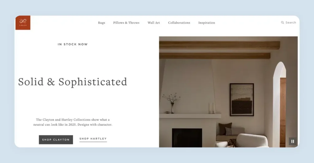
Loloi Rugs serves interior designers and furniture retailers with a curated selection of traditional and contemporary rugs. They’ve built a sophisticated website that balances professional trade features with consumer accessibility.
Their navigation menu includes detailed filtering options right up top – you can shop by color, size, shape, and even see exact measurements like “9 x 12” or “7+ Round” without having to dig into subcategories.

Their “Inspiration” tab showcases real projects from named interior designers, showing their rugs in actual homes and spaces.

Their “How to Buy” page clearly separates trade professionals from consumers, explaining exactly how each type of customer can purchase.

Key UX lesson: Make filtering simple and immediate. B2B buyers know exactly what they need, so put key filters where they expect them and make choices specific. This is what a b2b site with the best navigation for ordering supplies looks like in practice.
02. Emdee International – home décor and textile wholesale distributor

Emdee International serves interior designers and home décor retailers with a curated selection of textiles, pillows, and home accessories. Their platform combines wholesale functionality with strong visual presentation, targeting trade professionals who value both aesthetics and business efficiency.
Their homepage displays a live Instagram feed, giving buyers immediate social proof of real customers using their products. They also list upcoming trade show dates with booth numbers and locations, directly supporting buyers seeking them in new markets.

They also list all their upcoming trade show dates for 2025 with booth numbers and locations, making it super easy for buyers to find them at new markets.
Also read: Essential Trade Show Marketing Materials for a Successful Booth

Key lesson from this B2B ecommerce example: Show real customers using your products. Even B2B buyers want to see social proof before they buy. A live Instagram feed on your homepage gives instant credibility and shows that real people are actually buying and using what you sell.
03. Antique Curiosities – vintage and antique items for collectors

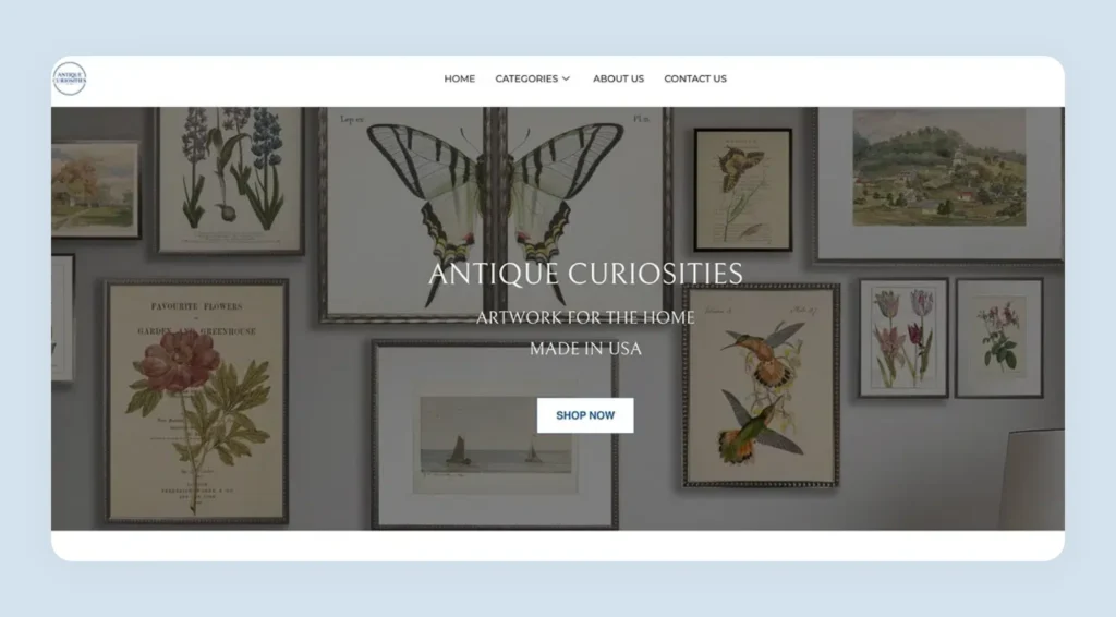
Antique Curiosities sells vintage and antique items to collectors and dealers. They work with individual artists to create unique pieces, focusing on authenticity and craftsmanship throughout their ecommerce site.
Their top banner reads: “Existing user? Click ‘Forgot Password’ to regain access. New user? ‘Sign up’ for a seamless online shopping experience.” This is the most intuitive b2b purchase website prompt, it guides both user types instantly. WizCommerce helped Antique Curiosities achieve a 90% reduction in navigation issues after their platform migration, as covered in detail in this guide to the best B2B ecommerce platforms.

We also love their “Meet the Artists” page that introduces each artist with photos and personal stories, adding a human touch to their business.

Key UX lesson: Make your call to action crystal clear from the moment visitors land. A single guiding message eliminates login confusion and gets buyers into the product catalog faster.
04. Howard Elliott Collection – home décor and furniture wholesale distributor

Howard Elliott Collection supplies home décor and furniture to interior designers and furniture retailers. They focus on statement pieces and unique designs that help their business customers create distinctive spaces.
Their customer testimonials appear front and center on the homepage, not buried in a separate section. The example review details a long strategic partnership and explains how the products directly help the reviewer’s online sales performance. Including her photo and company name makes the customer experience feel real and trustworthy.

Key UX lesson: Place your best testimonials where every visitor sees them. Real business buyers talking about real outcomes builds instant credibility with procurement teams evaluating new suppliers.
05. Luxe Light Decor – Lighting supply and decor company

Luxe Light Decor specializes in lighting fixtures and seasonal decorations for retailers and event planners. Their ecommerce site serves both commercial and residential markets from a clean, accessible interface.
Their navigation is built for speed: categories like “Garden,” “Holidays,” “Commercial” and “Events” sit clearly across the top. No confusing dropdowns and no hidden subcategories. This is a strong example of ecommerce navigation designed around how buyers think, not how products are internally organized.

We also love their “Similar Products” section that shows related items right on the product page, making it easy for buyers to discover additional products they might want to add to their order.
Their “Similar Products” section on product pages helps buyers discover additional items without leaving the ordering process.

Key UX lesson: Keep navigation dead simple. Clear, descriptive category names that match buyer thinking reduce bounce rates and shorten the path to purchase in any wholesale website example.
06. Karen Didion – Handcrafted Halloween and Christmas collectibles

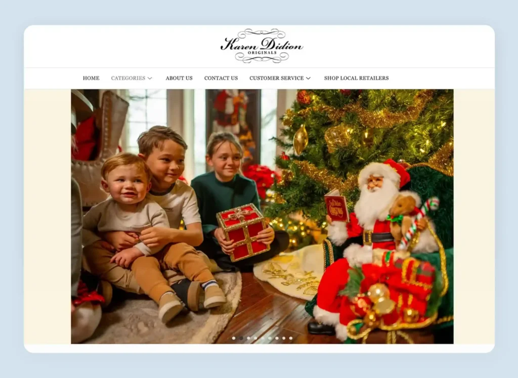
Karen Didion creates limited-edition collectibles for retailers and collectors. She specializes in holiday items that appeal to gift shops and serious collectors across her entire customer base.
The “Shop Local Retailers” feature directs buyers to Google search results showing nearby retailers who carry her products, complete with reviews and store hours. This drives foot traffic to retail partners, which builds customer relationships that support repeat wholesale orders.

Their detailed “About Our Collectibles” page tells Karen’s personal story and explains what makes each piece special, including numbering and authenticity certificates.

Key UX lesson: Tell the story behind your products. B2B buyers need to understand what makes your products special so they can communicate that story to their own customers and justify premium pricing confidently.
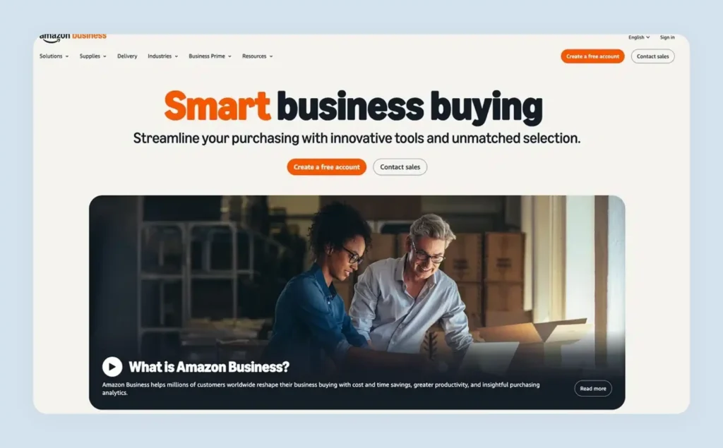
07. Amazon Business – B2B arm of Amazon with wide range of products

Amazon Business leverages Amazon’s infrastructure to serve business buyers with procurement-friendly features and volume pricing. They have adapted their familiar consumer platform for professional buyers while adding enterprise-grade order management functionality.

Instead of listing features, they use benefit-focused language like “Streamline purchasing” and “Maintain compliance” that immediately tells buyers what problem each tool solves. Every page includes success stories from recognizable companies like Nasdaq and The Walsh Group, showing real outcomes alongside specific use cases.

Key UX lesson: Lead with benefits, not features. “Buy in bulk to save money and time” converts better than “we have bulk ordering.” This is what b2b products examples, and benefit-led digital experience design look like at scale.
08. Alibaba Group – World’s largest B2B ecommerce marketplace

Alibaba connects manufacturers worldwide with buyers, focusing on large-volume transactions and international trade. They have built the world’s largest B2B commerce example by making global supplier discovery fast and trustworthy.

Their homepage shows “Frequently searched” terms you can click immediately, displaying impressive trust-building numbers like 200M-plus products, 200K-plus suppliers, and 5,900 product categories. They also emphasize security with “Verified Supplier” badges and “Trade Assurance” protection, which address buyer concerns about sourcing across geopolitical borders.

Plus, they heavily emphasize security with “Verified Supplier” badges and “Trade Assurance” protection that addresses the biggest concerns about international sourcing.

Key UX lesson: Make security your biggest selling point. B2B buyers are cautious about international suppliers, so verification systems, buyer protection programs and security badges displayed prominently calm those fears effectively.
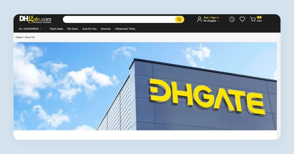
09. DHgate – International buyers connecting with wholesale suppliers

DHgate specializes in connecting international buyers with Chinese suppliers, focusing on small to medium-sized wholesale orders. Their platform balances supplier diversity with buyer protection for cross-border transactions.
Their site displays a wide range of payment methods front and center, from Apple Pay and Google Pay to Klarna, Afterpay and regional options like EBAN and Satispay. Displaying every accepted payment methods option removes a major barrier for international wholesale buyers who have varying preferences and currency requirements.

Key UX lesson: Show all your payment methods prominently. International buyers need to confirm their preferred method is available before they invest time in the ordering process.
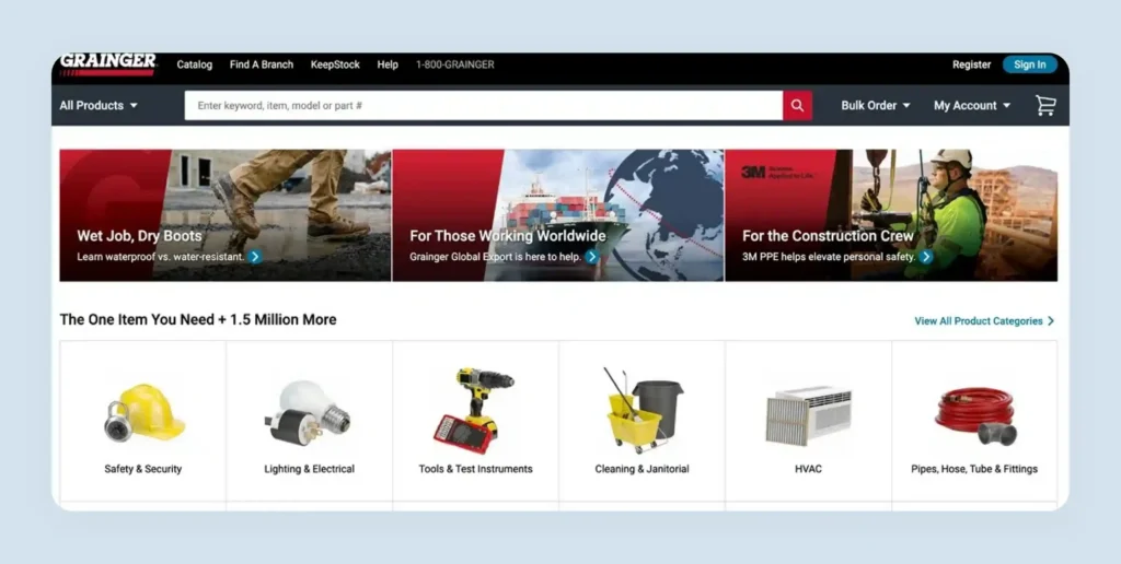
10. Grainger – Industrial supplies for healthcare, manufacturing, public sector

Grainger serves industrial buyers with MRO supplies, focusing on immediate availability and technical support. Their platform reflects the urgency and specific needs of industrial procurement teams who require speed and precision.
Right in their main navigation, a prominent “Bulk Order” dropdown lets buyers enter multiple item numbers and quantities in a “Line by Line” format. CRO banners throughout the site speak directly to their audience with conversion-focused messaging that addresses buyer pain points.


Key UX lesson: Use prime real estate for conversion-focused banners. Every banner should drive action by directly addressing buyer pain points, not by filling space with generic imagery.
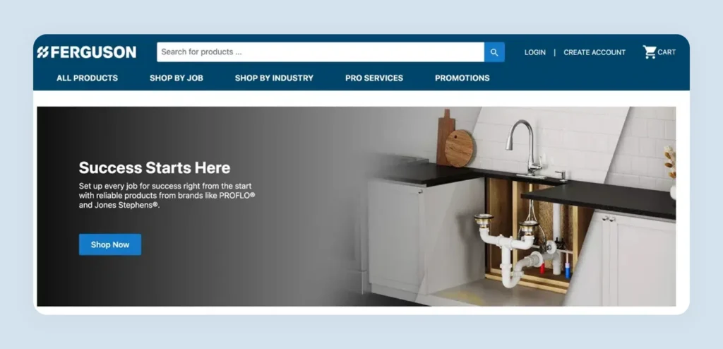
11. Ferguson – Plumbing, HVAC, and building supplies (B2B & B2C)

Ferguson serves professional contractors and DIY consumers with building supplies. They maintain distinct customer experience layers for each buyer type while offering a comprehensive selection of building materials in one online store.
They use video content prominently on their homepage to explain their business and showcase technical expertise. Their “Shop by Job” navigation is built entirely around buyer workflows: categories like “Replace Shower and Faucet Valve” or “Kitchen Sink and Faucet Installation” show exactly what products buyers need for each specific task.


Key UX lesson: Organize navigation around how your buyers work, not how your products are categorized internally. Job-based navigation turns your ecommerce site into a productivity tool for professional buyers.
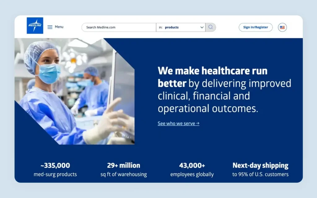
12. Medline – Medical supplies manufacturer and distributor

Medline combines manufacturing with distribution, serving healthcare facilities with comprehensive supply chain solutions. Their ecommerce platform reflects the specific needs of medical professionals who require fast access to specialized, compliant products.
Their navigation is organized by medical specialty: “Advanced Wound Care,” “Anesthesia,” “Diagnostics” and “Durable Medical Equipment” each lead to specific product listings like “Alginate/Fiber Dressings,” “Hydrocolloids” and “Wound Cleansers.” Medical professionals find exactly what they need without translating between internal categories and clinical terminology. This structure is the definition of a B2B site with the best navigation for ordering supplies in a regulated industry.

Key UX lesson: Organize your navigation exactly how your customers think about their work. Your site structure should mirror buyers’ mental model of their own industry and workflows.
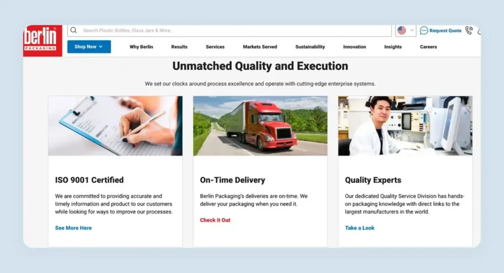
13. Berlin Packaging – Packaging items and services provider

Berlin Packaging is a leading provider of packaging solutions, serving manufacturers and packagers with containers, closures, and packaging design services. They combine product information with design consultations and custom development on one commerce site.

Their homepage features the latest company news prominently in the first fold, alongside credibility markers like “1,700-plus Global Suppliers” and “50,000-plus SKUs Available.” Offers appear in bright, eye-catching banners in high-visibility areas.

Key UX lesson: Feature your best offers prominently. B2B buyers are cost-conscious and a clear, visible offer can determine whether they stay or check a competitor. Significant cost savings messaging displayed front and center directly affects conversion rates.
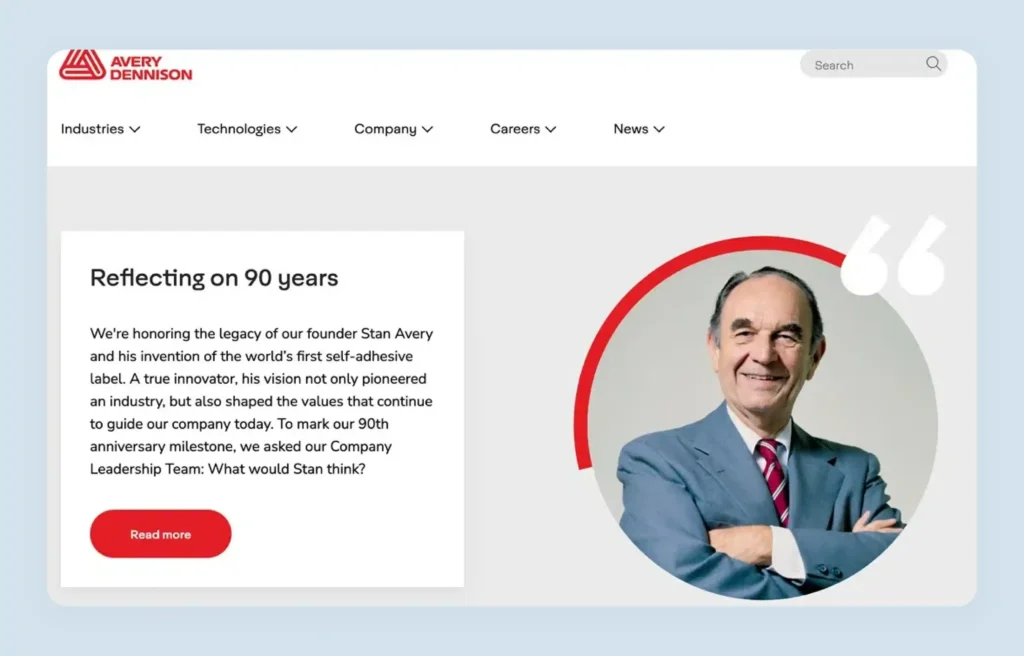
14. Avery Dennison – Labeling and packaging materials specialist

Avery Dennison provides labeling solutions across various industries, combining product sales with technical support and customization options. They serve global markets with specialized materials for complex labeling challenges in supply chain and retail.

They display company values throughout the site in a way that builds trust with professional buyers evaluating long-term partnerships. Their global website directory shows different divisions and language options, from their main corporate site in multiple languages to specialized platforms like AD-Explore and Apparel Solutions. This digital experience supports buyers across regions and languages with one coherent online store architecture.

Key UX lesson: Make your global presence obvious and accessible. A clear global directory demonstrates scale and reliability that builds customer relationships across international procurement teams.
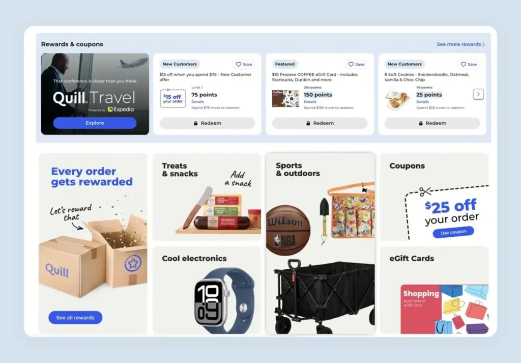
15. Quill – An office and educational supply provider (owned by Staples)

Quill serves businesses and educational institutions with office supplies, focusing on procurement efficiency and volume purchasing. As part of the Staples family, they combine extensive inventory with B2B-specific features and contract pricing built for professional buyers.

Offers appear everywhere: homepage banners, pop-up overlays, and a comprehensive rewards program showing travel partnerships, gift cards, and electronics redeemable with points. “Every order gets rewarded” communicates immediate value, building loyalty that drives repeat bulk orders from business accounts.

Key UX lesson: Build a system of visible incentives across your entire ecommerce site. Pop-ups, homepage banners, rewards sections and loyalty programs working together remind buyers why they should choose you over alternatives on every visit.
Key takeaways: What these successful B2B ecommerce examples have in common
Analyzing these 15 B2B ecommerce examples reveals consistent patterns that separate high-performing platforms from average ones. These are the key features that appear across every site in this list, regardless of industry or catalog size.
| Universal feature | Implementation details | Impact on buyers |
| User experience excellence | Intuitive navigation, visual clarity, buyer-focused design | Reduces friction, speeds up ordering |
| Advanced search & discovery | Faceted search, saved filters, personalized suggestions | Buyers find products efficiently |
| Mobile optimization | Responsive layouts, mobile-first search and reordering | Enables purchasing on any device |
| Content & resources | In-depth product specs, guides, application case studies, MSDS/downloads | Informs decisions, builds trust |
| Personalization | Account-level pricing, customer portals, saved settings | Boosts satisfaction and loyalty |
| Technical performance | Fast page loads, robust uptime, secure checkout | Ensures reliability and trust |
| Global accessibility | Multilingual support, local currencies, and compliance for international buyers | Expands customer base and reach |
Essential features that make B2B ecommerce websites successful
The best B2B ecommerce examples share the same underlying feature set. These nine capabilities address the challenges business buyers face daily and directly determine conversion rates, repeat ordering and long-term account value.
Intuitive catalog organization
Wholesale buyers usually know exactly what they need and want to find it fast. Unlike retail consumers who might browse for inspiration, wholesale buyers are on a mission with specific SKUs, product lines, or categories in mind. Your catalog structure should reflect how they think about your products by industry, application, or brand lines.
Poor organization forces wholesale buyers to dig through irrelevant categories, creating friction that leads to abandoned sessions. When buyers can’t find products quickly, they’ll try your competitors instead.
Organize your main categories around buyer intent, not internal product divisions. Use clear, descriptive names and limit subcategories to prevent decision paralysis. Advanced B2B ecommerce platforms like WizCommerce offer personalized catalog creation that allows you to create custom catalog views for different customer segments, ensuring each buyer type sees products organized in the most relevant way for their specific needs.

Bulk ordering features
Wholesale buyers order for inventory replenishment, project fulfillment and resale. Standard retail checkout flows create unnecessary friction for bulk orders at volume. Add quantity breaks that display bulk pricing automatically. Include reorder buttons on past orders and build custom order templates. Implementing CSV upload for order lists is critical for buyers managing hundreds of SKUs, as explored in WizCommerce’s guide to B2B ecommerce best practices.

Detailed product descriptions
Wholesale buyers need detailed product information to make informed decisions. They’re often purchasing for resale or specific projects and need to justify their choices with specifications, compatibility details, and use case scenarios.
Incomplete product information forces buyers to contact sales for basic details, slowing down the buying process. When information is missing, wholesale buyers assume you lack expertise or are hiding crucial details.
Include technical specifications, dimensions, compatibility information, and downloadable spec sheets. Add application examples and installation requirements where relevant. Research by Baymard Institute shows that 43% of websites don’t provide shipping information on product pages, but 64% of users actively look for it, which is critical for wholesale buyers planning inventory and delivery timelines.

Advanced search and filtering
With wholesale catalogs containing thousands of products, basic search functionality doesn’t meet buyer needs. Wholesale buyers need to filter by multiple criteria simultaneously—price range, brand, specifications, minimum order quantities, and availability.
Research by VML reveals that over 60% of B2B websites have filters that return less than a quarter of initial search results, essentially hiding relevant products from buyers. Additionally, 56% of B2B websites only return exact keyword matches, missing products when buyers use different terminology.
Implement faceted search that lets users filter by multiple attributes. Add autocomplete suggestions and search within results functionality. Ensure your search can handle synonyms and industry terminology. Advanced catalog management systems should include intelligent search that learns from buyer behavior and suggests relevant products even when exact terms don’t match.
WizCommerce addresses this with typo-tolerant AI search that learns from customer behavior and surfaces relevant products even when exact terms do not match, making it a strong example of ecommerce search done right.

Customer-specific pricing and discounts
Wholesale relationships often involve negotiated pricing, volume discounts, and special contract terms. Your website needs to reflect these unique pricing structures for each customer account, which typically requires user authentication to access.
Generic pricing doesn’t reflect the value of established wholesale relationships.
Baymard research also found that 48% of buyers abandon carts due to unexpected extra costs.
Wholesale buyers especially need transparent, account-specific pricing once they’re logged in.
Require login to access pricing, but make the registration process valuable and straightforward. Once logged in, display customer-specific pricing immediately. Show volume discount tiers clearly and include contract pricing where applicable. Make custom quote requests simple and prominent for non-registered visitors.
Platforms like WizPay by WizCommerce implement secure login-based pricing that automatically applies customer-specific discounts, contract terms, and volume pricing based on order quantities, ensuring each wholesale customer sees their exact negotiated rates. The platform supports multiple price lists (up to 15 different pricing structures) and allows line-level pricing adjustments for complex negotiations.

Responsive design that actually works
Mobile isn’t optional for wholesale operations anymore. Wholesale buyers research on phones during trade shows, tablets in warehouses, and desktops in offices. Your site must work perfectly across all devices without compromising functionality.
80% of B2B buyers use mobile devices to research products, and over 60% report that mobile played a significant role in recent purchases. Poor mobile experience drives buyers away.
Test your entire purchase flow on mobile devices. Ensure product details, pricing, and checkout work seamlessly. Don’t hide features on mobile; optimize them instead. Make sure bulk ordering and reorder functionality work as smoothly on mobile as on desktop.
Robust security features
Wholesale transactions involve larger amounts, sensitive pricing data, and corporate accountability. Security breaches in wholesale can affect entire supply chain operations, not individual accounts alone. 18% of users cite distrust with card security as a reason for cart abandonment, a critical issue for high-value bulk orders.
Display SSL certificates, security badges and industry certifications prominently throughout the ecommerce site, especially near checkout.
Self-service account management
Professional buyers expect to manage their own accounts without contacting support for routine tasks. A self-service portal that gives buyers access to order history, invoice downloads, approval workflows, and account settings directly reduces customer service load and improves the overall customer experience. Buyers who can act independently on their online channels place more orders and return more consistently.
ERP and systems integration
ERP integration is what separates a functional wholesale ecommerce platform from one that creates operational debt. Real-time sync between your ecommerce site and ERP systems ensures that pricing, inventory management, and order data stay accurate across every channel. Without ERP integration, teams spend hours reconciling valuable data manually, which limits the online revenue growth your platform was designed to support.
Customer registration benefits
Wholesale buyers value efficiency and personalization above all else. Registration should unlock features that make their job easier: order history, custom pricing, reorder capabilities, and personalized product recommendations based on purchase history.
Anonymous browsing doesn’t serve wholesale buyers well. They need accounts that remember their preferences, track orders, and provide business-relevant features. However, 24% of buyers abandon checkout when forced to create accounts, so registration must provide clear, immediate value.
Make registration valuable by offering immediate benefits. Provide comprehensive order history, save customer preferences, and enable features like quote requests and bulk ordering for registered users only.
Flexible checkout process
Wholesale purchases involve different payment methods, approval workflows, and delivery requirements than retail. Your checkout must accommodate purchase orders, net payment terms, and complex shipping arrangements to multiple locations. 17% of buyers abandon purchases due to complicated checkout processes alone, a costly failure for high-value wholesale orders.
Accepting multiple payment methods, including purchase orders and net terms, allowing split shipping, and including approval workflows for large accounts are all baseline requirements for any serious B2B ecommerce platform.

These features work together to create seamless experiences that respect how wholesale buyers actually operate.

The State of B2B Ecommerce in 2026: Key UX Trends
The landscape across the best B2B ecommerce examples is shifting fast. Business intelligence, buyer expectations, and digital transformation pressures are reshaping what a high-performing ecommerce platform must deliver as a baseline in 2026.
- AI-driven personalized catalogs: AI now adapts product catalog views in real time based on individual buyer behavior, past purchase data, and account-level preferences, removing the need for buyers to manually filter large assortments on every visit.
- B2C-style mobile-first navigation: The gap in user experience between consumer apps and wholesale portals is closing. Buyers now expect swipe-friendly layouts, predictive search, and one-tap reorder on mobile as standard features of any modern ecommerce platform.
- Self-service account portals as standard: Procurement teams expect full account management, including invoice access, order tracking, approval workflows, and credit visibility, directly on the ecommerce site without contacting support or account managers.
- Headless commerce for speed and flexibility: Cloud computing and headless architecture let businesses decouple their front-end digital experience from backend order management, enabling faster page loads, custom interfaces, and faster lead generation through improved conversion rates.
- Social commerce integration: Channels like LinkedIn and vertical-specific platforms are increasingly driving traffic directly to B2B ecommerce sites, making online sales discovery a multi-channel motion that begins outside the ecommerce website itself.
How can WizCommerce transform your B2B ecommerce success?
For businesses looking to implement or improve their ecommerce platform, WizCommerce offers a comprehensive solution built specifically for the business models and operational complexity of wholesale distributors, manufacturers and B2B sellers.
Through WizShop, WizCommerce delivers a fully branded ecommerce website with login-based custom pricing, real-time inventory management, approval workflows, AI-powered product discovery and one-click reordering — all on a single platform built for business buyers. The system connects to your ERP systems, CRM and accounting tools, unifying online channels and eliminating manual order processing that drains teams and creates errors.
The results across WizCommerce case studies include 83% faster order times, 30% more active online customers, and consistent revenue growth across the customer base. Antique Curiosities achieved 20% revenue growth and a 90% reduction in navigation issues. Business intelligence from integrated ERP integration and order management data gives leadership teams the valuable data they need to make faster decisions.
Contact WizCommerce today for a personalized demo to upgrade your b2b ecommerce operation and see what purpose-built wholesale infrastructure looks like in practice.
Frequently asked questions (FAQs) on B2B ecommerce
What is a B2B ecommerce website?
A B2B ecommerce website is an online platform where businesses sell products or services to other businesses. These sites support bulk ordering, tiered pricing, custom quotes, and multi-user accounts. They integrate with inventory, billing, and ERP systems to streamline complex ordering process workflows at scale.
Which B2B ecommerce platform is best?
The best ecommerce platform depends on your business size, industry, and specific needs. Key factors include scalability, customization, ERP integration capabilities, and support for complex pricing and ordering models. WizCommerce is purpose-built for wholesale distributors and manufacturers needing a complete ecommerce platform with AI-powered tools from day one.
What is an example of B2B ecommerce?
B2B ecommerce examples include wholesalers selling products in bulk to retailers, manufacturers supplying parts to distributors, and service providers offering subscription tools to business customers. Any online transaction between two businesses, using features like bulk pricing, RFQs, or personalized catalogs, qualifies as a b2b commerce example.
How do B2B and B2C ecommerce websites differ?
B2B ecommerce is tailored to high-volume buyers with longer sales cycles, featuring custom pricing, quotes, and bulk orders. B2C sites focus on individual consumers with fixed pricing and fast checkouts. B2b and B2C website examples differ most visibly in account management, approval workflows, and ERP integration depth.
What industries use B2B ecommerce?
B2B ecommerce spans manufacturing, wholesale distribution, healthcare, construction, food and beverage distribution, packaging, and professional services across various industries. Any sector where one business sells products or services to another business at volume, whether raw materials, office supplies, or industrial components, operates across online channels using B2B ecommerce infrastructure to manage order processing and customer relationships efficiently.
What features should a B2B ecommerce website have?
A strong B2B ecommerce website needs custom pricing, bulk ordering, ERP integration, approval workflows, advanced search and filtering, self-service account management, and flexible payment methods. It should also deliver real-time inventory management, mobile-responsive design, and seamless integration with ERP systems across all online channels where business buyers place orders and manage their accounts independently.
Skip to content